# Bookmarked: The inconsistency of Tahoe's design

- Author: @gurupanguji
- Date: 2026-02-08
- URL: https://gurupanguji.com/blog/2026/02/08/the-inconsistency-of-tahoes-design/
- Categories: link, technology
- Tags: apple, hig, human-interface-guidelines, macos, user-interface, ux

---


> I even collected them all together, so the absurdity of the situation is more obvious.
>
> <img src="/assets/images/blog/image-6.png" alt="" class="wp-image-16559"/>

*Source:* [It’s hard to justify Tahoe icons @ tonsky.me](https://tonsky.me/blog/tahoe-icons/)

<!-- wp:paragraph -->
<p>Oh how the mighty have fallen. </p>
<!-- /wp:paragraph -->

<!-- wp:paragraph -->
<p>I recommend reading the whole post. It's an opus to how Tahoe UX design is an utter denunciation of the Macintosh Human Interface Guidelines - once considered to be the gospel of how interface design must be done. </p>
<!-- /wp:paragraph -->

<!-- wp:coblocks/gif -->
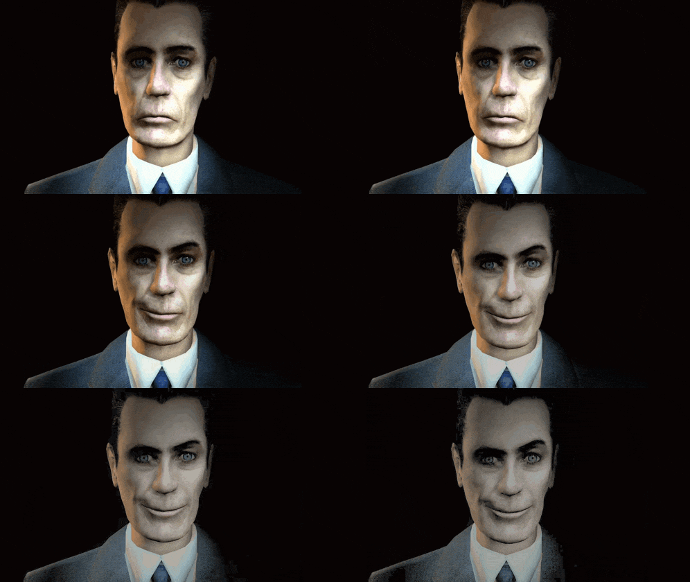
<figure class="wp-block-coblocks-gif"><img src="/assets/images/blog/giphy.gif" alt=""/><figcaption>I know it's beating a dead horse at this point</figcaption></figure>
<!-- /wp:coblocks/gif -->

<!-- wp:paragraph -->
<p>I know it's beating a dead horse at this point. Tahoe is a complete disgrace when it comes to user interface design. I don't want to conflate this as denouncing Liquid Glass - although I still have issues with it. It's how Tahoe is the worst implementation of it to the point where Mac OS isn't what it is supposed to be. </p>
<!-- /wp:paragraph -->

<!-- wp:paragraph -->
<p>Anyway, here's to hoping all the changes with the leadership is all going to bear fruit sometime soon. </p>
<!-- /wp:paragraph -->

<!-- wp:paragraph -->
<p>I've also realized that I might skip a mac OS version for the first time ever, esp now that I've successfully reverted my Mac back to Sequoia. </p>
<!-- /wp:paragraph -->
