 gurupanguji
Shift & ⌥ & Splat & ⎋ Escape
This is one of those cryptic things that I would love to understand the thinking behind. Because, on the surface, this breaks so many rules:
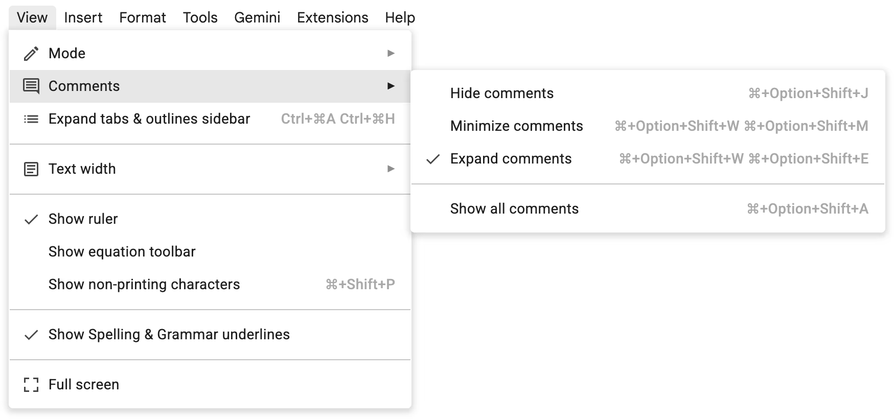
Source: Shift & ⌥ & Splat & ⎋ Escape
When the keyboard shortcuts (which are dual) are longer than the menu explanation themselves.
Marcin posits:
The only explanation for this I can think of off the top of my head is this: these were invented somewhere else (Word?) and inherited by Docs to respect motor memory of the users transition from the older app. That still doesn’t cover the presentation, plus there is a way for Docs to redesign the shortcuts to be better for people who are starting anew.
Source: Shift & ⌥ & Splat & ⎋ Escape – Unsung
I am debating if this is a reason because Docs is built on the browser. Do they have to figure out a way to ensure that you can bring focus into a specific place as they need to contend between the OS (Windows, Mac, Unix, Linux, others), Browser (Chrome, Safari, Edge, others), and then depending on those two combos, where the focus is?
Whatever be the case, one thing I am confident of is that Google Docs designers are also just as likely to think that this is ugly.
So, the questions that remain are:
- What’s the real reason?
- Can someone in Google do something about it? If you can, can you also replace them to all icons or spelling? ⌘ is an icon but
OptionandShiftare spelled out?
